Matching Color Palettes in Edible Prints
Estimated reading time: 8 minutes
Key Takeaways
- Matching color palettes in edible prints enhance the visual appeal of desserts.
- Edible printing allows for personalization and creativity in dessert decoration.
- Understanding color theory is crucial for creating harmonious and impactful designs.
- Seasonal and themed color combinations can transform dessert displays to match event aesthetics.
- Consistent design elements, such as cake toppers, tie the entire dessert table together.
Table of contents
- Understanding Edible Prints
- The Importance of Color Palettes
- Matching Color Palettes in Edible Prints
- Seasonal Color Combinations for Dessert Tables
- Themed Party Package Ideas
- Designing Consistent Sets of Toppers
- Conclusion
- Additional Resources
Understanding Edible Prints
What Are Edible Prints?
Edible prints are custom designs, photographs, or patterns printed onto specialized papers, such as icing sheets or wafer paper using food-grade inks. Edible printing technology revolutionizes the dessert industry, allowing for creativity and personalization like never before. These prints can be used on various sweet treats, including cakes, cupcakes, cookies, and chocolates.
Versatile Applications of Edible Prints
Edible prints offer endless customization options for a wide range of events. Here’s how edible prints fit into event planning and dessert decoration:
- Weddings: Personalize cakes with monograms, images of the couple, or floral designs.
- Birthdays: Create fun themes with characters or favorite colors for kids’ parties.
- Corporate Events: Utilize logos and brand colors to make a professional impression.
Materials and Technologies Used
Creating edible prints involves specific materials and advanced technology, including:
- Specialized Printers: These printers are designed to use food-safe inks that ensure all elements are safe for consumption.
- Edible Paper: Options such as icing sheets or wafer paper serve as the canvas for printing designs.
- Food-Grade Inks: CMYK inks allow for vibrant, true-to-life color reproduction in edible formats.
When properly designed, these prints can significantly enhance dessert displays at any event by providing a unique, custom touch.
The Importance of Color Palettes
Why Color Palettes Matter
Color palettes play a crucial role in the aesthetics of dessert tables. They enhance the theme and foster emotional connections with the guests. Here’s why understanding color palettes is vital:
- Visual Appeal: Color combinations contribute to the overall attractiveness of dessert displays, making them stand out.
- Emotional Connections: Colors have psychological effects. For example, warm tones like red and orange evoke excitement and passion, while cool tones such as blue and green promote calmness and serenity.
Bakers and event planners are encouraged to focus on cohesive color palettes to ensure harmony across all decorative elements. This approach creates a unified ambiance that not only enhances the aesthetic but also enhances guest satisfaction.
The Psychology of Colors
Different colors invoke various emotional responses and can dramatically influence the atmosphere of any event. Here are some key insights into color psychology:
- Warm Colors: Reds, oranges, and yellows are stimulating and can evoke excitement and enthusiasm.
- Cool Colors: Blues, greens, and purples offer a calming effect and promote tranquility.
- Neutral Colors: Whites, grays, and browns provide balance and can serve as a perfect backdrop for more vibrant hues.
By understanding the significance of colors, event planners can craft dessert displays that resonate with attendees’ emotions while also enhancing the chosen theme.
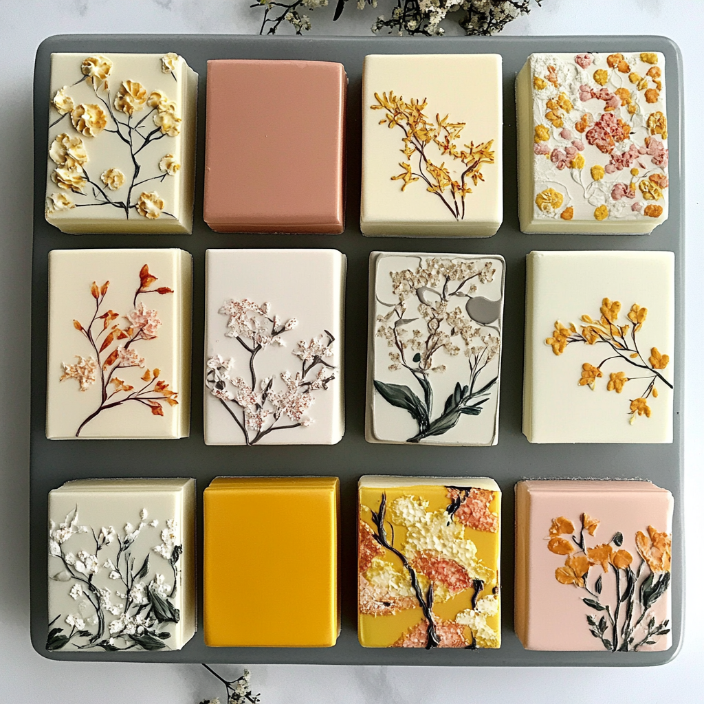
Matching Color Palettes in Edible Prints
Elements Involved in Creating Matching Color Palettes
Achieving a perfect color match in edible prints requires expertise and attention to detail. Here are key elements involved in creating matching color palettes:
- Understanding Color Theory: Familiarity with color theory principles is essential. You can use schemes such as:
- Analogous: Colors that sit next to each other on the color wheel (e.g., yellow, yellow-green, and green) create serene and harmonious designs.
- Monochromatic: Variations of a single color create a sophisticated and modern feel.
- Complementary: Colors opposite each other on the color wheel (like blue and orange) create contrast and vibrancy.
Tips on Selecting Colors
Selecting colors for edible prints requires some thoughtful consideration. Here are essential tips to ensure that your color choices stand out:
- Testing Colors: Always test colors by printing samples on edible paper before finalizing your designs. This helps to assure that the final product matches your vision.
- Use High-Resolution Images: Using high-resolution images ensures better clarity, which is particularly important for detailed designs.
Examples of Successful Edible Print Designs
Consider these practical examples that highlight how colors can be coordinated in designs for various events:
- Corporate Logos: Incorporating exact brand hues into edible prints reinforces brand identity.
- Seasonal Designs: For spring events, pastel colors like lavender and mint green can beautifully enhance cupcakes and cake designs.
With these strategies, you can create matching color palettes in edible prints that elevate dessert displays at any occasion.
Seasonal Color Combinations for Dessert Tables
Popular Seasonal Color Combinations
Seasonal themes provide endless inspiration when selecting color palettes for dessert tables. Here are some popular seasonal color combinations to consider:
- Spring: Soft pastels like mint green, baby pink, and delicate lavender create a light and airy feel.
- Summer: Bright hues such as coral, sunny yellow, and vibrant aqua showcase a festive and energetic palette.
- Autumn: Earthy tones like burnt orange, mustard yellow, and deep burgundy evoke warmth and rustic charm.
- Winter: Elegant whites, icy blues, and deep greens create a cozy, chilled ambiance perfect for the holiday season.
These seasonal colors not only enhance the overall aesthetic but can also inspire dessert ideas that align with the seasonal theme.
Visual Examples
Consider utilizing images of dessert tables showcasing these seasonal colors. A vibrant summer display could feature bright coral cupcakes topped with matching edible prints, while an autumn-themed table may include cakes adorned with rich earth tones.
Leveraging Seasonal Themes
Event planners can leverage seasonal color combinations by offering innovative dessert ideas:
- Spring: Floral cakes decorated with pastel icing prints.
- Summer: Tropical-themed cupcakes adorned with bright, fun images.
- Autumn: Cookie sets shaped like leaves and pumpkins with warm color prints.
- Winter: Desserts featuring snowflakes or holiday motifs in cool colors.
These dishes can beautifully complement the seasonal decor and create a memorable sensory experience for guests.
Themed Party Package Ideas
Creative Themed Party Ideas
For cohesive dessert displays, consider incorporating themed party packages. Here are some theme ideas where color palettes can be creatively employed:
- Weddings: Use elegant florals and romantic tones for an enchanting touch.
- Children’s Birthdays: Incorporate vibrant, character-based themes tailored to kids’ favorites.
- Corporate Events: Use logos and brand colors to create a polished and professional presentation.
Tailoring Edible Prints to Specific Themes
Edible prints can be tailored to reflect specific themes effectively. Consider featuring elements in desserts that align with the theme and color palette:
- Weddings: Customized fondant toppers with the couple’s initials complement the overall color scheme.
- Birthday Parties: Fun character designs printed on cookies match the event’s playful vibe.
Highlighting Cohesive Designs
Highlighting cohesive designs with matching colors can take an event to the next level. For example:
- Use edible prints across multiple dessert items like cupcakes, cookies, and centerpiece cakes all featuring the same color palette.
- Incorporate matching cake toppers, using designs that reflect the overall theme, ensuring consistency across all treats.
These strategies ensure a stunning and visually appealing dessert table that captivates your guests.
Designing Consistent Sets of Toppers
Role of Cake Toppers
Cake toppers play a significant role in enhancing dessert displays. They serve as focal points, elevating visual interest while tying the design together.
Guidance on Designing Consistent Sets
To create consistently designed sets of toppers, keep the following in mind:
- Uniform Style: Maintain a cohesive style across all toppers to create visual harmony.
- Incorporate Personalized Elements: Include personalized details that resonate with the event, making it special.
- Balancing Colors: Use a mix of bold and subtle colors from your chosen palette to draw attention without overwhelming the design.
By focusing on these aspects, you can effectively create designing consistent sets of toppers that enhance the beauty of your dessert displays while also showcasing the matching color palettes in edible prints.
Conclusion
In conclusion, mastering the art of matching color palettes in edible prints is key to crafting stunning and cohesive dessert designs. Utilizing seasonal themes, event-specific tones, or unique prints can create displays that are visually captivating and carry emotional resonance. For bakers and event planners, employing these color strategies enhances the overall experience for guests.
We encourage you to explore creative options utilizing seasonal colors and themed packages for your next celebration. If you’re interested in elevating your dessert presentations, consider reaching out to edible printing services for help in bringing your vision to life!
Additional Resources
To expand your understanding of edible prints and color theory, consider exploring the following topics:
- DIY edible print tutorials.
- Guides on color theory in event planning.
- Inspiration galleries for themed party designs.
These resources will help you harness the full potential of matching color palettes in edible prints and create mesmerizing dessert displays.
Frequently Asked Questions
1. What are edible prints and how are they made?
Edible prints are custom designs printed onto edible paper using food-grade inks. They are made using specialized printers and can be applied to various desserts like cakes, cookies, and cupcakes.
2. How do I choose the right color palette for my event?
Consider the theme of your event, the season, and the emotions you want to evoke. Utilize color theory principles such as analogous, monochromatic, or complementary schemes to create a harmonious palette.
3. Can I customize edible prints to match my branding?
Yes, incorporating your logos and brand colors into edible prints is a great way to reinforce brand identity at corporate events.
4. What materials are safe for edible printing?
Edible prints are made using specialized edible papers like icing sheets or wafer paper and food-grade inks that are safe for consumption.
5. How can seasonal colors enhance my dessert display?
Seasonal colors can complement the event’s theme, create a cohesive look, and evoke the right emotions, making your dessert display more appealing and memorable.